Icons
Icons are simplified visual representations of a specific action, object or concept.
Icons come in two variant types: Outline and Solid. Please note that all icons within the icon set have an outline variant, but not all icons have a solid variant.
Solid icons may be faster to recognize than outline icons due to less visual noise, especially depending on the complexity of the icon. Solid icons better represent how we view objects, whereas outline icons are silhouettes and therefore can take longer to perceive.
Outline icons place less emphasis on non-imperative items and are more recognizable when they have wider inner spacing. They’re also better to use when you need to make subtle design cues more noticeable.

Icon size will vary based on use case and system requirements. Standard sizing ensures components maintain a consistent spatial relationship with surrounding elements.
We recommend using a size multiplier for icons when its purpose needs to be emphasized; typically standalone and not paired with text.

| Size token | Multiplier | High Density (HD) | Medium Density (MD) | Low Density (LD) | Touch Density (TD) |
|---|---|---|---|---|---|
--salt-size-icon | x1 | 12 * | 12 | 14 | 16 |
| x2 | 20 | 24 | 28 | 32 | |
| x3 | 30 | 36 | 42 | 48 | |
| x4 | 40 | 48 | 56 | 64 |
* Icons have a minimum size set at 12px and should not be displayed any smaller. For high density this means the default size of an icon is 12px, but the rest of the scale grows based on small base dimension.
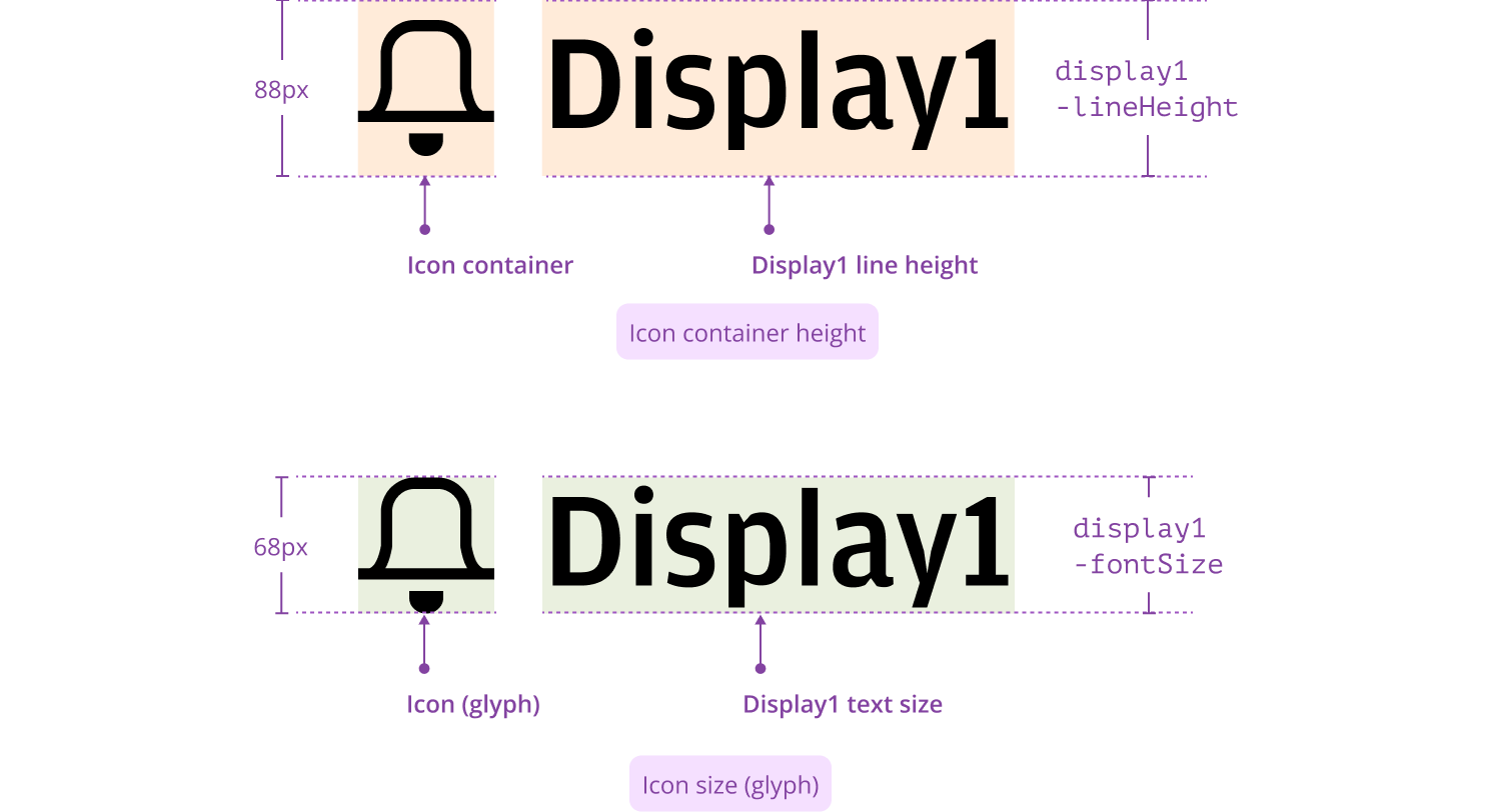
- Match the icon container height to the text line-height.
- Match the icon glyph size to the text font-size.
When an icon is paired with display or heading text styles, the icon size (i.e., the glyph) is aligned with the text size, and the icon’s container is aligned with text line height. This approach ensures the icon and text remain visually balanced and that the icon stays perfectly aligned with the text block, even in multi-line layouts.
Spacing between an icon and its paired text varies by context. The sub-sections below cover key scenarios.
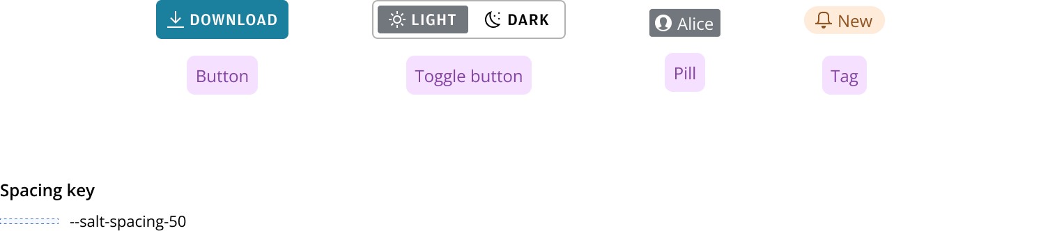
Apply --salt-spacing-50 — the icon is used within small, primitive components to describe the interaction or label. This applies to:
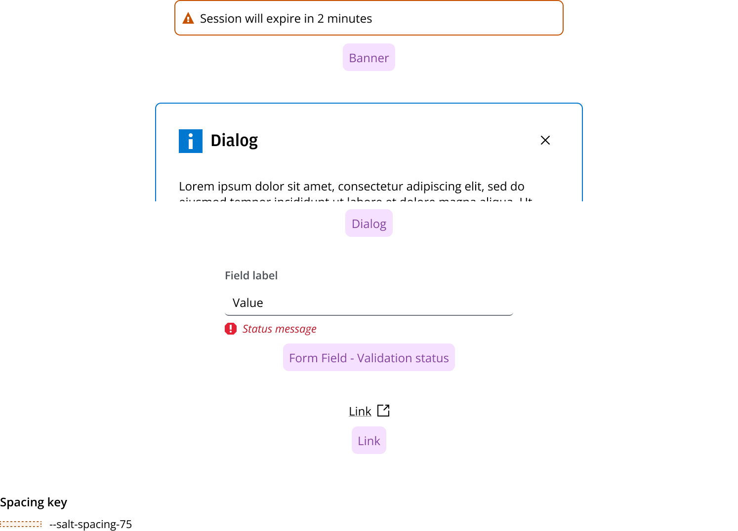
Apply --salt-spacing-75 — the icon describes a heading or statement; often used within ‘messaging’ type components or where the icon is part of a sentence; it isn’t constrained within a small component. This applies to:
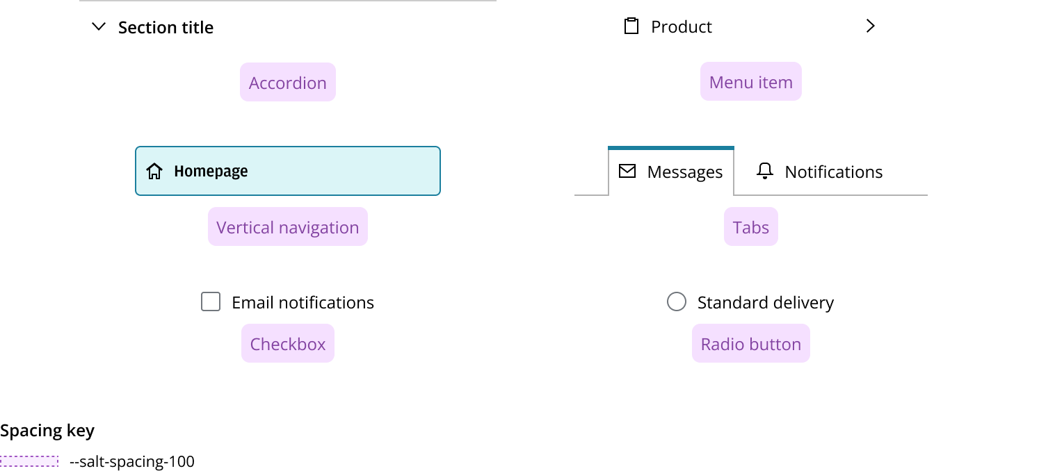
Apply --salt-spacing-100 — the icon describes the title or label of ‘stackable’ (i.e., those with a slightly larger height, designed to accommodated nested controls, such as buttons) or repeated elements (where clean vertical alignment is required); also applies to radio/checkbox controls. This applies to:
This spacing update is experimental. We welcome your feedback to help us refine and optimize this guideline. The goal is to apply these updated rules to existing components, including Dialog (currently using --spacing-75, see above). Please reach out to the team with any thoughts or suggestions on this new spacing rule.
To ensure visual balance and readability, spacing between icons and Heading/Display text is tailored according to the size of the text. This approach helps maintain a harmonious and comfortable layout across different heading and display levels.
This is the recommended spacing in editorial/marketing layouts and where headings are used within components.
| Heading/Display text | Spacing between Icon & Text |
|---|---|
| Display1, Display2 | --salt-spacing-300 |
| Display3, Display4 | --salt-spacing-250 |
| H1, H2 | --salt-spacing-150 |
| H3, H4 | --salt-spacing-100 |

We appreciate your thoughts and feedback on any content in the Salt foundations. Please contact us if you have any comments or questions.